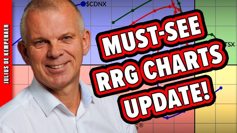
The RRG chart (Relative Rotation Graph) is a dynamic and sophisticated tool used by stock market analysts and traders to visually track the relative strength and momentum of various assets compared to a designated benchmark. This graphical representation allows market participants to quickly identify investment opportunities and trends in the financial markets.
At its core, the RRG chart is comprised of four quadrants, each representing different market conditions based on the relative strength and momentum of assets. The Leading quadrant consists of assets that are both strong and improving in momentum, indicating potential investment opportunities. Assets in the Weakening quadrant are losing momentum but still remain strong, potentially signaling a shift in market direction. The Lagging quadrant contains assets that are both weak and deteriorating in momentum, suggesting underperformance. Finally, the Improving quadrant holds assets that are weak but showing signs of improvement.
One crucial advantage of the RRG chart is its ability to display the intermarket relationships between various assets. By plotting these relationships on a quadrant-based chart, analysts can quickly identify potential correlations and divergences in market behavior. This can provide valuable insights into sector rotation, market trends, and potential investment opportunities.
Recent updates to the RRG chart on StockCharts.com have enhanced its functionality and usability for market participants. These updates include improved customization options, enhanced performance metrics, and a user-friendly interface. The new features allow users to tailor the RRG chart to their specific needs, making it a more versatile tool for analyzing market dynamics.
Moreover, the RRG chart now offers better support for sector analysis, allowing users to compare the relative strength and momentum of different industries within the stock market. By tracking sector rotation on the RRG chart, investors can make informed decisions about sector allocation and portfolio diversification.
Another notable update to the RRG chart is the incorporation of technical indicators and overlays, which provide additional insights into market trends and potential entry/exit points. By combining technical analysis with the visual representation of the RRG chart, traders can refine their trading strategies and make more informed decisions.
In conclusion, the RRG chart on StockCharts.com is a powerful tool that offers valuable insights into market dynamics, sector rotation, and potential investment opportunities. The recent updates to the chart have further enhanced its functionality and usability, making it an essential resource for market participants looking to stay ahead of market trends and make informed investment decisions.

